

WordPress security dashboard widget: the state of your site the moment you sign in

WordPress dashboard widgets

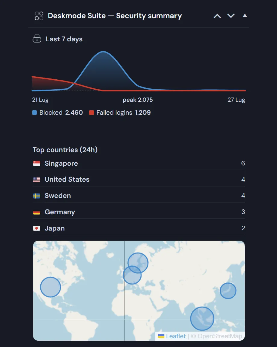
Blocks and failed logins over the last seven days, the countries they come from, and how long your SSL certificate has left. All in one panel, without opening anything.
The two series stay separate, because a request refused by your rules and a wrong password are not the same event.

How WordPress security dashboard widget works

What's in the WordPress Dashboard Widgets?

  • A seven-day chart with two curves: blocked attempts and failed logins, day by day.
  • Three headline numbers: blocked in the last 24 hours, blocked in the last 7 days, failed logins in the last 24 hours.
  • The five countries with the most blocks in the last day, with flag, full name and count.
  • A map where each country is a circle whose area is proportional to its blocks, so one very large source doesn't visually erase the rest.
  • The SSL certificate with days remaining and the expiry date, shown as a warning under thirty days and an alert under fifteen.
  • Two buttons to open login security and the Network Info page.

Two different quantities, never added together

The panel carries a legend explaining the difference, because conflating them leads to the wrong conclusion:

  • Blocked — requests refused by your rules: country, blocklist, allowed hours, rate limit. They never reached the password check.
  • Failed logins — attempts that reached the password check and WordPress refused: wrong password, or no such user.

A spike in blocks means your rules are working. A spike in failed logins means something is getting through them. Those are opposite pieces of news, and they need to be read apart.

Honest numbers, no cost

  • The counts come from an aggregate counter, not from the detailed log: that log is rate-limited to one entry per address every ten minutes so an attack can't flood it, which would make log-based totals an arbitrary fraction of reality.
  • The chart is SVG generated on the server: no external library, no JavaScript, working under strict security policies and in dark mode.
  • Countries are read from the cache the security module already filled, so drawing the widget triggers no outbound requests.
  • The panel only appears to users who can manage site options, and can be hidden from Screen Options like any other dashboard widget.
  • If there were no blocks in the last 24 hours it says so, instead of showing an empty map.

There's a performance twin: a second panel shows the site's average load time over thirty days, with a daily curve and a moving average. It's described in Site health and charts.
Read the documentation

WordPress dashboard widgets screenshot >
WordPress dashboard widgets: seven-day chart, top countries and map.

Frequently asked

WordPress dashboard widgets: the questions we get most

Five answers on what they show, what they cost in performance, and how to get them out of the way.

Which WordPress dashboard widgets does the plugin add?

Two. The WordPress security dashboard widget sums up blocked attempts over the last 24 hours and the last 7 days, failed logins over the last 24 hours, the five countries producing the most blocks with a map, and how many days remain on your SSL certificate.

The second shows the average load time of your public site over thirty days, with the daily curve and a moving average laid over it, so one bad day doesn’t look like a trend.

Why are blocks and failed logins two separate numbers?

Because they mean opposite things, and adding them together leads to the wrong conclusion. Blocked means requests refused by your rules — country, blocklist, allowed hours, rate limit — which never reached the password check. Failed logins reached it and were rejected by WordPress.

A spike in blocks means your rules are working; a spike in failed logins means something is getting through them. The panel carries a legend explaining it, because this is the distinction most security plugins lose along the way.

Are the numbers reliable?

The counts come from an aggregate counter, not from the detailed log. That distinction matters: the log is rate-limited to one entry per address every ten minutes so an attack can’t flood it, which means counting from there would give an arbitrary fraction of reality.

On the map each country is a circle whose area is proportional to its blocks, not its radius: with the radius, a source ten times larger would appear a hundred times larger and visually erase everything else.

Do they slow the dashboard down?

The charts are SVG generated on the server: no JavaScript library to download, no outbound call to draw them, and they work under strict content security policies and in dark mode. Countries are read from the cache the security module already filled, so rendering the panel costs no network request.

If there were no blocks in the last 24 hours, the widget says so instead of drawing an empty map.

Can I hide them or move them?

Yes. They are registered through the standard dashboard widget API, so they drag and collapse like any other, and they can be hidden from Screen Options in the top right.

They only appear to users who can manage site options: an editor or an author never sees them, so there is no risk of showing security data to people who shouldn’t be reading it.

Shopping Basket