Deskmode Pro Suite – Customize & Secure Your WordPress Admin
A WordPress admin plugin to Customize and secure your WordPress dashboard
How WordPress health score works
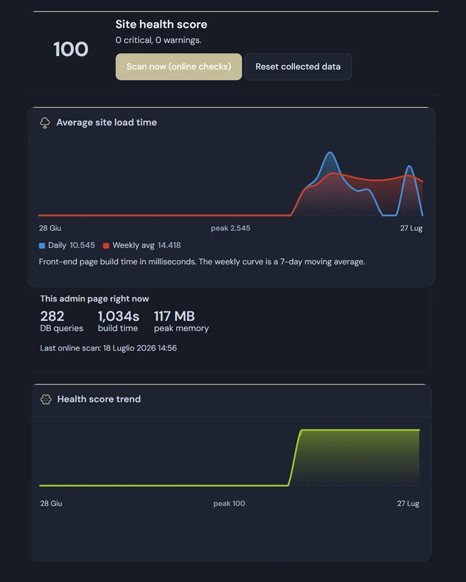
The score is not an opinion
It starts at a hundred: every critical issue takes fifteen points off, every warning six. Informational entries take nothing. Each line says what was found and what to do about it, so the number always breaks down into its reasons.
Environment and security
- PHP version: out of support, nearing end of life, or fine.
- The dashboard not being served over HTTPS.
- PHP errors visible to visitors, leaking paths and system details.
- The theme and plugin file editor left enabled: anyone who gains admin access can run code instantly.
- Open registration combined with Administrator as the default role — meaning anyone who signs up becomes an admin.
- Administrator accounts created in the last thirty days, listed by name.
- Active plugin files that no longer exist, which can mean tampering or a broken update.
WordPress performance monitoring and database
- The weight of autoloaded options, with the five largest — one of the most common causes of slowness.
- Whether a persistent object cache (Redis, Memcached) is in place.
- How many plugins are active, and how many inactive ones are still installed.
- Pending updates: outdated plugins remain the number one way sites get hacked.
- Database: revisions, trash, spam comments, expired transients and total size.
which plugin is slowing down WordPress, by name
Turn on query profiling and the time spent on the database is attributed to each individual plugin: milliseconds per request, average queries per request and the total. Sampling happens on the public site only, and the feature is designed to be switched on for a while and then off again.
The outbound connection monitor records which external servers each plugin contacts. It may be entirely normal — licensing, updates — or unwanted tracking: the module shows it and leaves the judgement to you.
After every update, the average page build time is compared with the previous period. If it got noticeably worse, a warning says by how much and after which update.
The limits: CPU time, memory and PID per plugin are not shown, because they cannot be measured per plugin from inside WordPress. Database time is the slice that genuinely can be measured, and that is the slice you get.
Online checks
The optional scan queries the WordPress.org directory to flag plugins untouched for more than two years and those declaring compatibility only with an older WordPress than yours. Add a free WPScan token and it also checks for known vulnerabilities, including the version each was fixed in.
The charts
- Average build time for public pages, with a weekly curve that is a seven-day moving average.
- The health score trend, snapshotted once a day.
- Measurement samples one request in five and keeps a daily aggregate for the last seventy days, so it doesn't weigh on the site.
- Charts are SVG generated on the server: no external library, no JavaScript, working under strict security policies and in dark mode.
- At the top of the page there is also a live measure of the screen you're looking at: database queries, build time and peak memory.