Deskmode Pro Suite – Customize & Secure Your WordPress Admin
A WordPress admin plugin to Customize and secure your WordPress dashboard
How WordPress dark mode works
Dark mode in the WordPress admin: personal, not site-wide
Dark mode isn't a global setting an administrator imposes on everyone: it's a preference saved on each user's profile. People working at night keep it on, people in a bright office don't, and neither bothers the other.
- It's toggled from a floating button in the bottom-right corner — sun or moon depending on the state — and from the dedicated item in the Deskmode Suite menu in the admin bar.
- The choice is stored both in the browser and on the user profile: the browser applies it immediately, the profile keeps it for next time and for other devices.
- The switch happens in place: no reload, no white flash between screens.
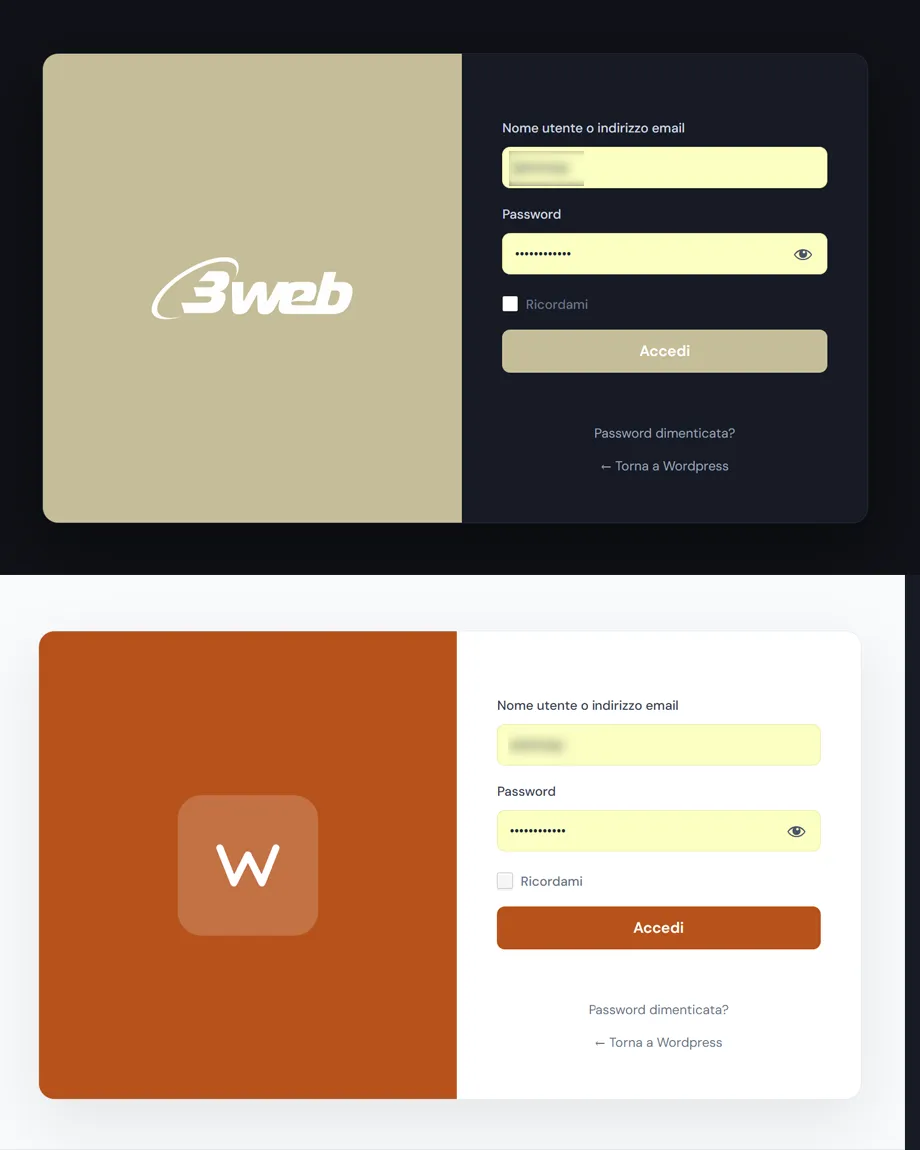
- The preference applies to the login screen too, which is where the wrong contrast is most irritating.
- It works alongside the accent chosen in the admin theme: colour and brightness are two separate levers.
Where it deliberately steps back
Dark mode switches itself off in two places, and that's a considered choice:
- The theme customizer: there you're judging how the public site looks, not the dashboard, and a dark interface around it would skew your reading of the colours.
- Elementor screens: Elementor forces a light background on its own panels. Layering a dark theme over that would produce light text on a light background — unreadable. Better not applied than applied badly.
There's also a class for excluding specific screens, if a plugin you use behaves the way Elementor does.
Done properly
- The content editor gets its own treatment: a dark writing area without the post content itself changing away from how it will actually publish.
- Login field backgrounds are handled in CSS rather than inline styles, so the toggle really does update the colour live; any inline styles left by older versions or by the browser's autofill are removed, since they'd stay stuck at the starting value.
- Animations respect the system preference for reduced motion.