Deskmode Pro Suite – Customize & Secure Your WordPress Admin
A WordPress admin plugin to Customize and secure your WordPress dashboard
Customize WordPress admin: How it works
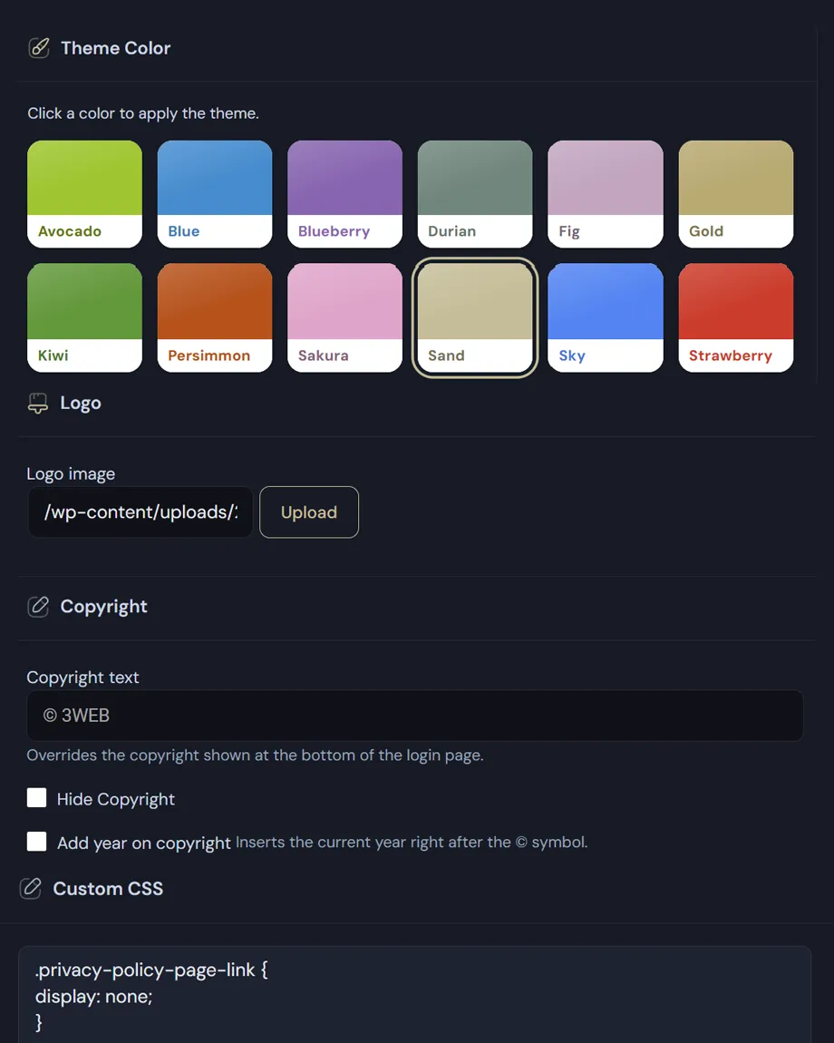
One accent, twelve choices
The palette is twelve named colours rather than twelve hex codes: Avocado, Blueberry, Durian, Fig, Gold, Kiwi, Persimmon, Sakura, Sand, Sky, Strawberry and the default blue. Each carries its own lighter and darker variant, so borders, active states and hover effects stay coherent without setting them one by one.
- The picker lives in the admin bar: Deskmode Suite menu, Theme colour, with a coloured dot beside each name and a tick on the active one. You change it from wherever you are, not from a settings page.
- The chosen colour is applied as a CSS variable, so everything inherits it: menus, buttons, panels, SVG charts, the 404 page, maintenance mode and the login screen.
- Alongside the accent there are six interface variants in separate files — the default, the dark one and four alternatives — changing the character of the dashboard, not just its colour.
- WordPress's own colour scheme picker is removed from user profiles: two overlapping theme systems contradict each other, and whichever loads last wins.
Contrast is calculated, not hoped for
Where the accent serves as a background, the text colour isn't imposed but computed from the background's luminance. On nine of the twelve themes that yields dark text; on Blueberry, Persimmon and Strawberry it would fall below the minimum contrast ratio, so there it goes light instead. It's the kind of detail you only notice when it's missing — a grey label on a red panel that nobody can read.
Customize WordPress Admin Theme: what it changes if you hand over sites
- The dashboard stops looking like a generic control panel and starts looking like part of the work you delivered.
- The logo and colours on the login screen are the first thing a client sees every time they sign in.
- If you manage several sites, different colours make it instantly obvious which dashboard you're in — a trivial mistake that gets expensive.
Note about light and dark mode in the WordPress admin: the accent colour is a site setting, changed by whoever can manage options. Light or dark mode, by contrast, is each user's personal preference.
Contrast is calculated, not hoped for
Where the accent serves as a background, the text colour isn’t imposed but calculated from the background’s luminance, so it always clears the 4.5:1 ratio the WCAG require.